
Android Development, Part 4: UI Basics
posted on 09/21/10 at 07:32:37 pm by Joel Ross
Let's preface this by stating up front that I've never been very good with UI design. Switching platforms hasn't really changed that, so while I'll touch on how I'm creating my user interfaces in Android, certainly don't copy my screens. A blind monkey could probably do better!
I'm getting ahead of myself though. This is part 4 in an ongoing series about my experiences developing an Android app to use with Pay It Square. If you're just joining us, first, thanks! and second, here's where we've been so far:
- Part 0: Introduction
- Part 1: Project Structure and Tools
- Part 2: Presenters and Activities
- Part 3: Roboguice
Let's start with the basics. You have two choices when laying out an activity. You can either dynamically add controls to the activity through code, or you can design your layout in an XML file. So far, I've stuck with the XML file approach, except in one case - a tab-based page. But even in that case, I have a base layout in XML, and each individual tab has its own XML layout as well.
In my limited experiences, there's three main ViewGroups to start your activities with. Each will have child Views or ViewGroups, but the type of ViewGroup you choose will determine how it actually looks.
- LinearLayout: This organizes child elements into either a horizontal or vertical row.
- RelativeLayout: This is the ViewGroup I've found to be the most flexible, but also the hardest to work with. More on that later.
- TableLayout: From a web developer's perspective, this is very similar to HTML tables.
Remember that each of the above ViewGroups can have child ViewGroups, so your layout options are pretty flexible. There are other types of ViewGroups you can use as well, such as a ListView and TabHost. There's more, but I'll stick to the ones I've had experience with so far.
Inside each ViewGroup, you'll have Views. These are things such as text boxes, labels, drop downs, etc. Basic UI elements. How they're displayed is determined by both the ViewGroup they are in and the properties on the View.
Let's look at an example of the layout of the activity I went over in part 2 (setting the user name and password to log into Pay It Square). First, I created an XML file under res/layout called settings.xml. I'm using a RelativeLayout, as I think that provides the most flexibility, although in this case, it's probably not necessary. Here's the layout in its entirety.
1: <?xml version="1.0" encoding="utf-8"?>
2: <RelativeLayout
3: xmlns:android="http://schemas.android.com/apk/res/android"
4: android:layout_width="fill_parent"
5: android:layout_height="fill_parent">
6: <TextView
7: android:id="@+id/signIn"
8: android:text="@string/signInHeader"
9: android:layout_width="fill_parent"
10: android:layout_height="wrap_content"
11: android:gravity="center"
12: android:textSize="20px"
13: android:padding="10px"
14: android:textStyle="bold"
15: android:textColor="#669900" />
16: <EditText
17: android:id="@+id/userName"
18: android:layout_width="fill_parent"
19: android:layout_height="wrap_content"
20: android:hint="@string/userNameHint"
21: android:layout_below="@+id/signIn"
22: android:layout_marginLeft="10px"
23: android:layout_marginRight="10px"
24: android:imeOptions="actionNext" />
25: <EditText
26: android:id="@+id/password"
27: android:layout_width="fill_parent"
28: android:password="true"
29: android:layout_height="wrap_content"
30: android:layout_below="@+id/userName"
31: android:hint="@string/passwordHint"
32: android:layout_marginLeft="10px"
33: android:layout_marginRight="10px"
34: android:imeOptions="actionDone" />
35: <Button
36: android:text="@string/signIn"
37: android:id="@+id/save"
38: android:layout_width="fill_parent"
39: android:layout_height="wrap_content"
40: android:layout_below="@+id/password"
41: android:textSize="16px"
42: android:layout_marginLeft="10px"
43: android:layout_marginRight="10px"
44: android:textStyle="bold" />
45: </RelativeLayout>
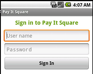
I have a RelativeLayout that is set to fill everything it can. In this case, it fills the screen, but it could also be included as an activity inside a tab. In that case, it'd fill up the whole tab. Inside the ViewGroup, I have four Views - a label describing what the screen is for, two textboxes for entering a user name and password, and finally, a button, which checks your credentials.
Tying the XML to an activity is pretty simple. In the override for the onCreate() method of the activity, you reference the generated R class and load it that way:
1: @Override
2: public void onCreate(Bundle savedInstanceState) {
3: super.onCreate(savedInstanceState);
4: setContentView(R.layout.settings);
5: presenter.InitializeWith(this);
6: }
Here's what it looks like when rendered:
The XML itself is pretty straightforward. You can set the color of text (android:textColor), size (android:textSize), alignment (android:gravity), padding (android:padding) and margin (android:layout_margin), etc.
Since I'm using a RelativeLayout, I need to specify where my elements are relative to other items. In this case, I've only used android:layout_below, but there are also options for putting elements next to other elements, as well as how they should be aligned in relation to other elements.
One attribute you can provide on Views is android:imeOptions. These aren't explicitly needed, but they provide for a better user experience. In the layout above, I have android:imeOptions="actionNext" on my user name EditView. This means that when the virtual keyboard is shown while your cursor is in the user name field, the keyboard will show a "Next" button instead of the default return. Touching that button moves the cursor to the Password field, where the IME option is set to Done. The keyboard will now show Done, and touching that will hide the keyboard. There are other IME actions available, but the two I've used served my needs just fine.
There are a lot more thorough tutorials on UI layout than what I could provide, including a great series on Tekpub by Donn Felker, but there are a few tips I'd like to highlight. For me, while they were small things, they really helped make layouts less painful and more user friendly.
- Use margins and padding. It sounds so simple, but it really enhances the look when text or text boxes aren't butting right up against the edge of the screen or another control.
- Order matters. I'm talking specifically about the RelativeLayout here. I used DroidDraw to lay out a relative screen, specifying exactly where all my elements should be in relation to each other, and then generated the XML file. When I pulled it into my application, controls were rendering on top of each other, and what was really odd was that switching from one tab to another and then back again caused the layout to slowly fix itself. By the third or fourth switch, the layout looked great. What I eventually came to realize was that DroidDraw seemingly dropped controls into the XML in a random order. I had controls at the top of the XML file that specified its layout relative to a control lower in the file. As a result, when it came time to render (at least the first time), the control it was supposed to be positioned next to hadn't been rendered. Just changing the order of elements fixed the view.
- Lose the labels. I'm a web developer through and through. I'm trained to layout my screens in table format with a label on the left, and a textbox on the right. But this isn't the web, and space is limited. Make use of android:hint to add watermarks on your text input, and stretch those textboxes out as wide as you can. This also helps with the ordering and relative layouts, because for most screens, the layout is much simpler once you drop all the unnecessary labels.
- Use the imeOptions and inputType. I touched on this already, but it's worth repeating. It's annoying to be required to enter an email address in an application and not have the "@" on the primary keyboard screen. It's equally annoying to have the keyboard have a return key instead of a "Next" key when there's more textboxes to fill out. It's such a simple thing to implement, yet makes the application so much easier to use.
I do plan to go a little more in-depth on some of the more complicated activities I'm using, like lists and tabs. But first, I've been getting a few questions about how I configured Eclipse and my projects to get it all working, so next time, we'll take a step back and look at that.
Categories: Android